CLIENT:
VTS (In-house)
YEAR:
2021-2025
EXPERIENCE:
ART DIRECTION, UX/UI, BRANDING

VTS
about.
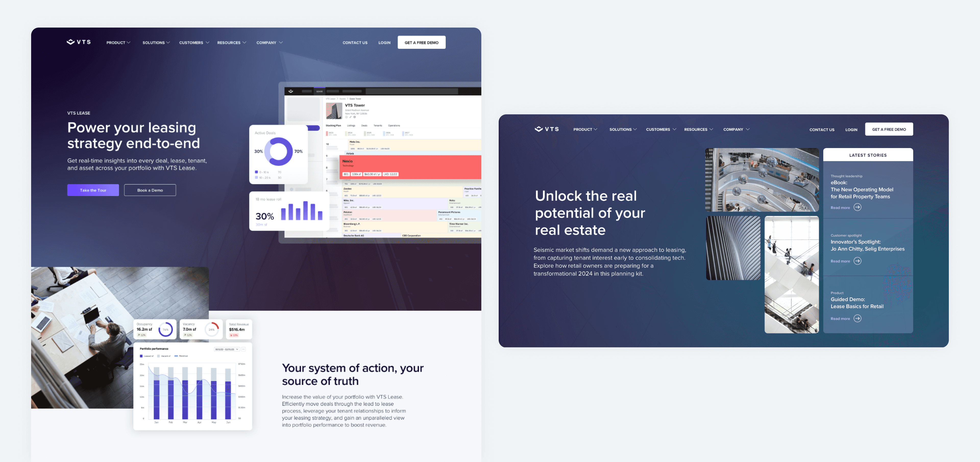
VTS is transforming commercial real estate (CRE) by providing a modern operating system that streamlines leasing, asset management, and tenant engagement. As Senior Design Manager, I played a key role in evolving the brand’s visual identity, ensuring consistency across marketing and product experiences. I led a strategic brand refresh that modernized VTS’ design system, creating a more cohesive, scalable, and engaging experience that reinforced the company’s leadership in the CRE space.
challenge.
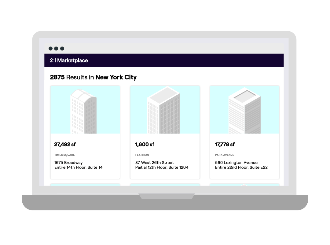
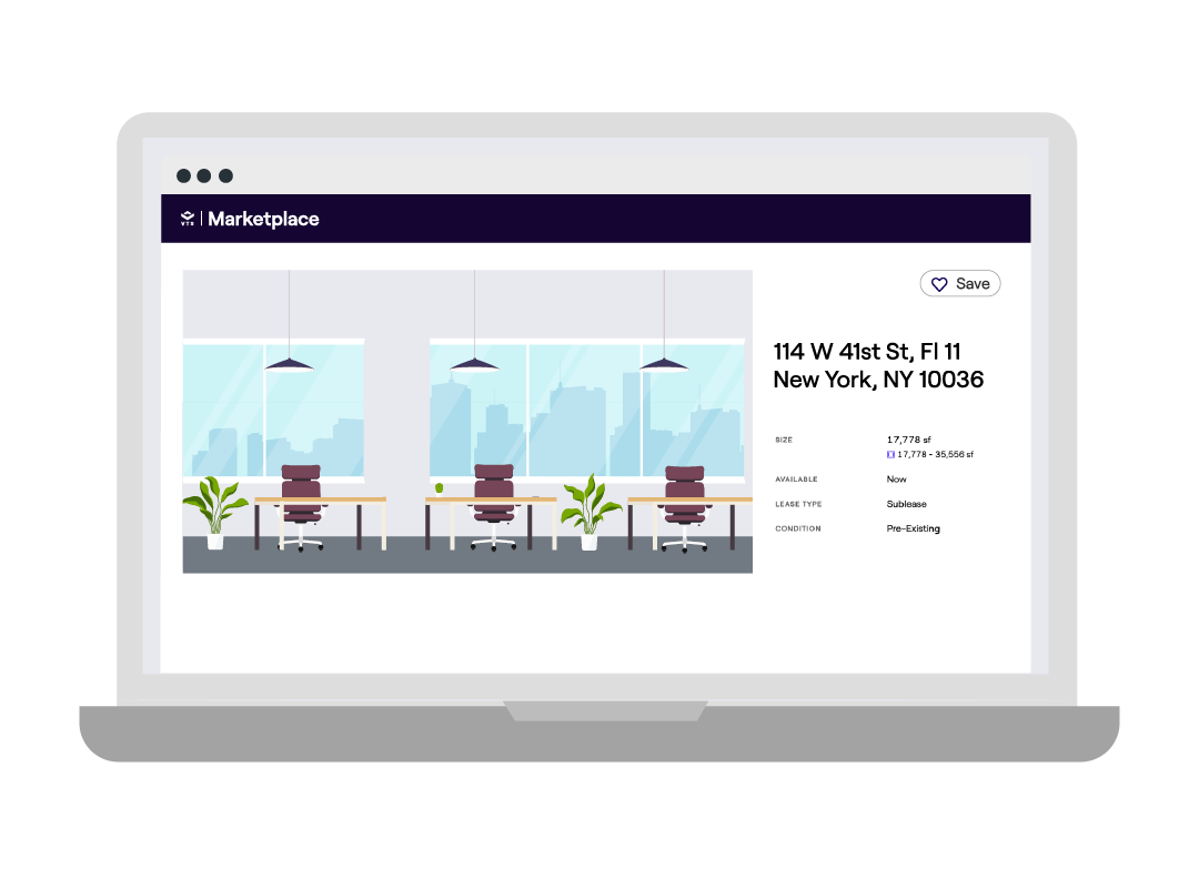
When I joined VTS, the brand felt heavy and outdated—relying on serif typography, dense layouts, and inconsistent visuals across its product suite. Each of the four products had its own distinct style, creating a fragmented and confusing brand experience.
The Transformation
To modernize the brand and unify the product ecosystem, I led a brand refresh focused on clarity, cohesion, and scalability:
Typography Overhaul – Replaced serif fonts with a clean, modern sans-serif system for improved readability and a more contemporary feel.
Streamlined Design System – Simplified heavy visuals into a clean, structured aesthetic that emphasized whitespace and hierarchy.
Unified Product Suite – Introduced a flexible gradient color system that gave each product a distinct identity while maintaining visual harmony across the suite.
Scalable Consistency – Ensured the brand showed up cohesively across all digital touchpoints—from web to product to marketing campaigns.


results.
The modernization of the VTS brand resulted in a more cohesive and visually compelling identity that better reflects its industry leadership. Unifying the product suite under a consistent visual framework strengthened brand recognition, improved user navigation, and made it easier for customers to understand the full value of VTS' offerings. This transformation not only improved engagement across marketing channels but also reinforced trust and clarity in communications, setting the stage for continued growth.


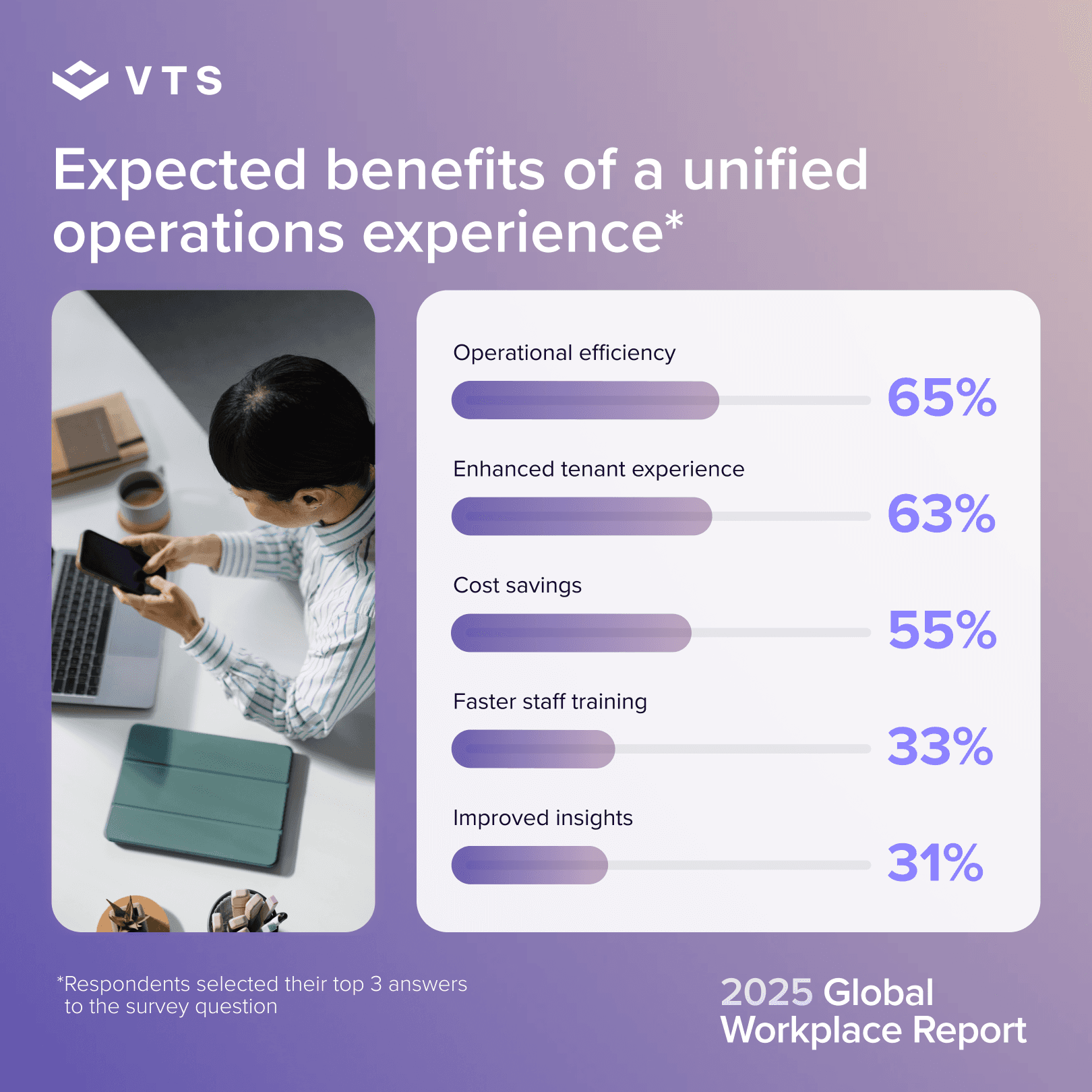


more to explore.


VTS
CLIENT:
VTS (In-house)
YEAR:
2021-2025
EXPERIENCE:
ART DIRECTION, UX/UI, BRANDING
VTS is transforming commercial real estate (CRE) by providing a modern operating system that streamlines leasing, asset management, and tenant engagement. As Senior Design Manager, I played a key role in evolving the brand’s visual identity, ensuring consistency across marketing and product experiences. I led a strategic brand refresh that modernized VTS’ design system, creating a more cohesive, scalable, and engaging experience that reinforced the company’s leadership in the CRE space.
challenge.
When I joined VTS, the brand felt heavy and outdated—relying on serif typography, dense layouts, and inconsistent visuals across its product suite. Each of the four products had its own distinct style, creating a fragmented and confusing brand experience.
The Transformation
To modernize the brand and unify the product ecosystem, I led a brand refresh focused on clarity, cohesion, and scalability:
Typography Overhaul – Replaced serif fonts with a clean, modern sans-serif system for improved readability and a more contemporary feel.
Streamlined Design System – Simplified heavy visuals into a clean, structured aesthetic that emphasized whitespace and hierarchy.
Unified Product Suite – Introduced a flexible gradient color system that gave each product a distinct identity while maintaining visual harmony across the suite.
Scalable Consistency – Ensured the brand showed up cohesively across all digital touchpoints—from web to product to marketing campaigns.
The Concept
At its core, the VTS brand is about bringing clarity and control to a traditionally opaque industry. Commercial real estate can be complex and fragmented, and the brand needed to reflect the simplicity and transparency the platform provides.
The updated design system reinforces this concept by being:
Clear – Prioritizing clean layouts, intuitive navigation, and straightforward language.
Structured – Using grids and strong hierarchy to mirror how VTS brings order to CRE workflows.
Professional, yet human – Balancing enterprise-grade confidence with an approachable tone and warm visual cues.
results.
The modernization of the VTS brand resulted in a more cohesive and visually compelling identity that better reflects its industry leadership. Unifying the product suite under a consistent visual framework strengthened brand recognition, improved user navigation, and made it easier for customers to understand the full value of VTS' offerings. This transformation not only improved engagement across marketing channels but also reinforced trust and clarity in communications, setting the stage for continued growth.
CLIENT:
VTS (In-house)
YEAR:
2021-PRESENT
EXPERIENCE:
ART DIRECTION, UX/UI, BRANDING
VTS
CLIENT:
VTS (In-house)
YEAR:
2021-2025
EXPERIENCE:
ART DIRECTION, UX/UI, BRANDING
VTS is transforming commercial real estate (CRE) by providing a modern operating system that streamlines leasing, asset management, and tenant engagement. As Senior Design Manager, I played a key role in evolving the brand’s visual identity, ensuring consistency across marketing and product experiences. I led a strategic brand refresh that modernized VTS’ design system, creating a more cohesive, scalable, and engaging experience that reinforced the company’s leadership in the CRE space.
challenge.
When I joined VTS, the brand felt heavy and outdated—relying on serif typography, dense layouts, and inconsistent visuals across its product suite. Each of the four products had its own distinct style, creating a fragmented and confusing brand experience.
The Transformation
To modernize the brand and unify the product ecosystem, I led a brand refresh focused on clarity, cohesion, and scalability:
Typography Overhaul – Replaced serif fonts with a clean, modern sans-serif system for improved readability and a more contemporary feel.
Streamlined Design System – Simplified heavy visuals into a clean, structured aesthetic that emphasized whitespace and hierarchy.
Unified Product Suite – Introduced a flexible gradient color system that gave each product a distinct identity while maintaining visual harmony across the suite.
Scalable Consistency – Ensured the brand showed up cohesively across all digital touchpoints—from web to product to marketing campaigns.
The Concept
At its core, the VTS brand is about bringing clarity and control to a traditionally opaque industry. Commercial real estate can be complex and fragmented, and the brand needed to reflect the simplicity and transparency the platform provides.
The updated design system reinforces this concept by being:
Clear – Prioritizing clean layouts, intuitive navigation, and straightforward language.
Structured – Using grids and strong hierarchy to mirror how VTS brings order to CRE workflows.
Professional, yet human – Balancing enterprise-grade confidence with an approachable tone and warm visual cues.
results.
The modernization of the VTS brand resulted in a more cohesive and visually compelling identity that better reflects its industry leadership. Unifying the product suite under a consistent visual framework strengthened brand recognition, improved user navigation, and made it easier for customers to understand the full value of VTS' offerings. This transformation not only improved engagement across marketing channels but also reinforced trust and clarity in communications, setting the stage for continued growth.