VTS
︎︎︎ Art Direction, Branding
VTS is changing the way that commercial real estate (CRE) is done—disrupting a $15 trillion industry by becoming the modern operating system for CRE.
In my role as Senior Design Manager, I spearhead the creative strategy for key design projects, delivering top-notch campaigns. I collaborate with marketing, product, and sales teams to develop a cohesive brand system and update living brand guidelines for logos and marketing materials. My projects include a wide range of creative assets such as web elements, animations, social media content, eBooks, infographics, and trade show materials. Additionally, I successfully managed external vendors and freelancers to ensure high-quality deliverables across all marketing channels, elevating VTS's brand presence and engagement.


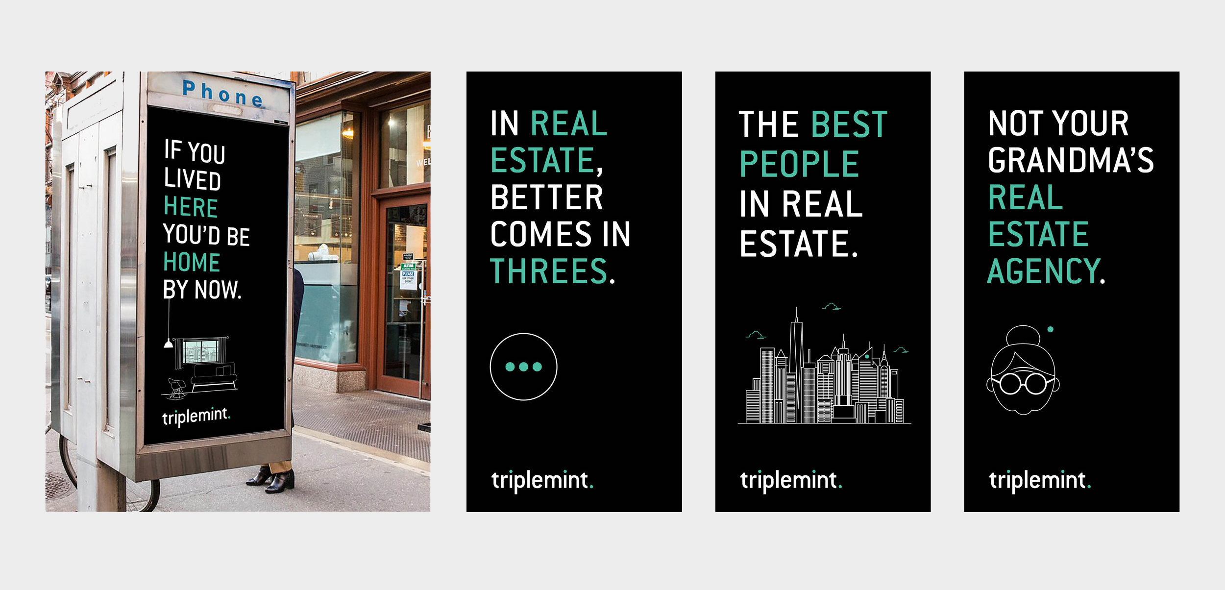
Triplemint
︎︎︎ Art Direction, Branding
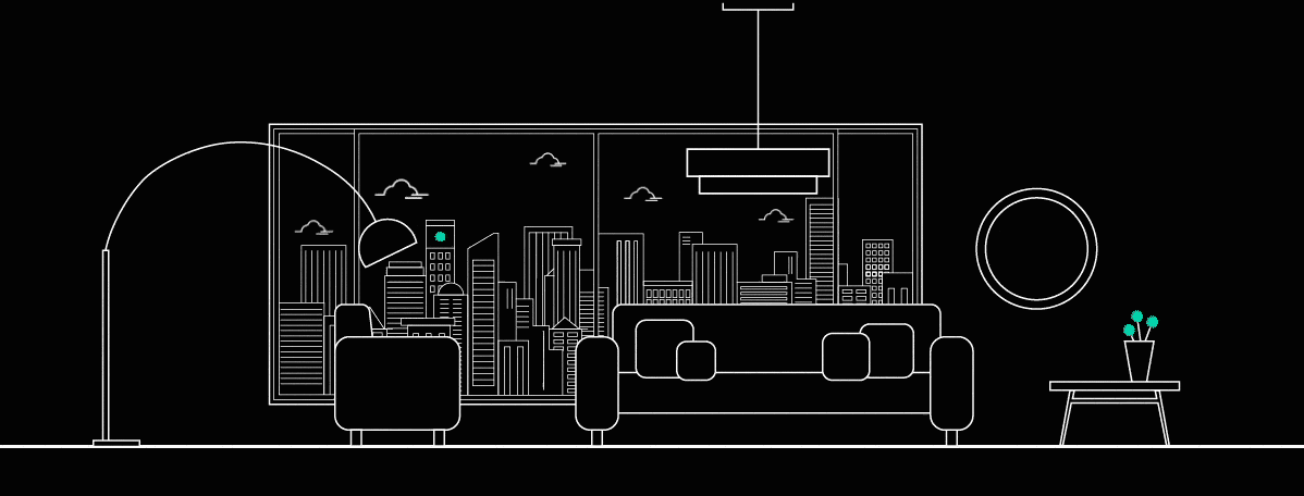
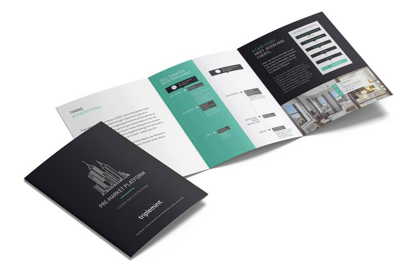
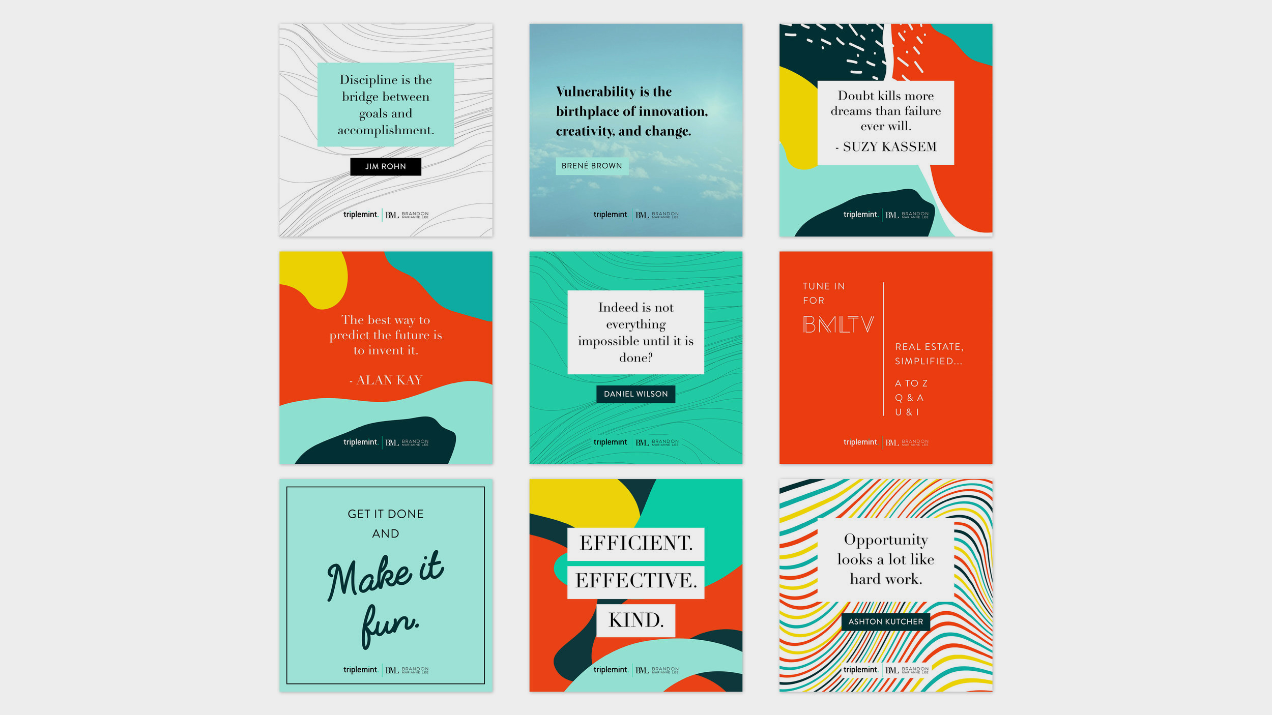
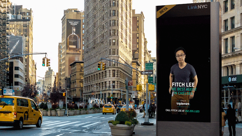
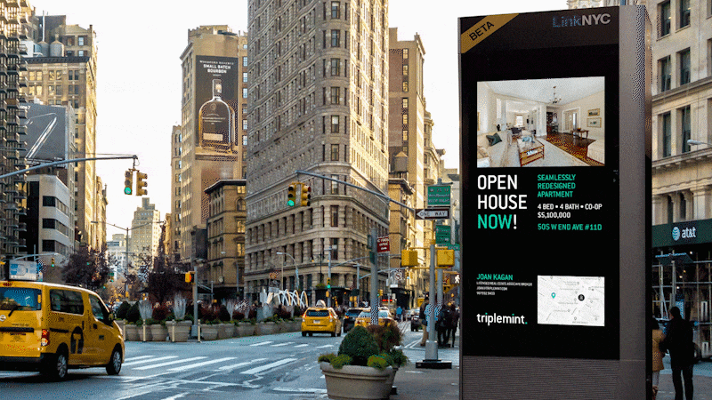
Triplemint is a real estate brokerage on a mission to create a better experience for buyers, sellers, and renters. It’s an innovative full-service brokerage combining technology, teamwork, and personalized service to serve the modern generation of homebuyers and sellers. Triplemint leverages data and predictive analytics to give clients access to homes before they are listed, resulting in more options for buyers and a strategic approach for sellers.
The Triplemint brand essence is
ACCESS. DATA. SERVICE.
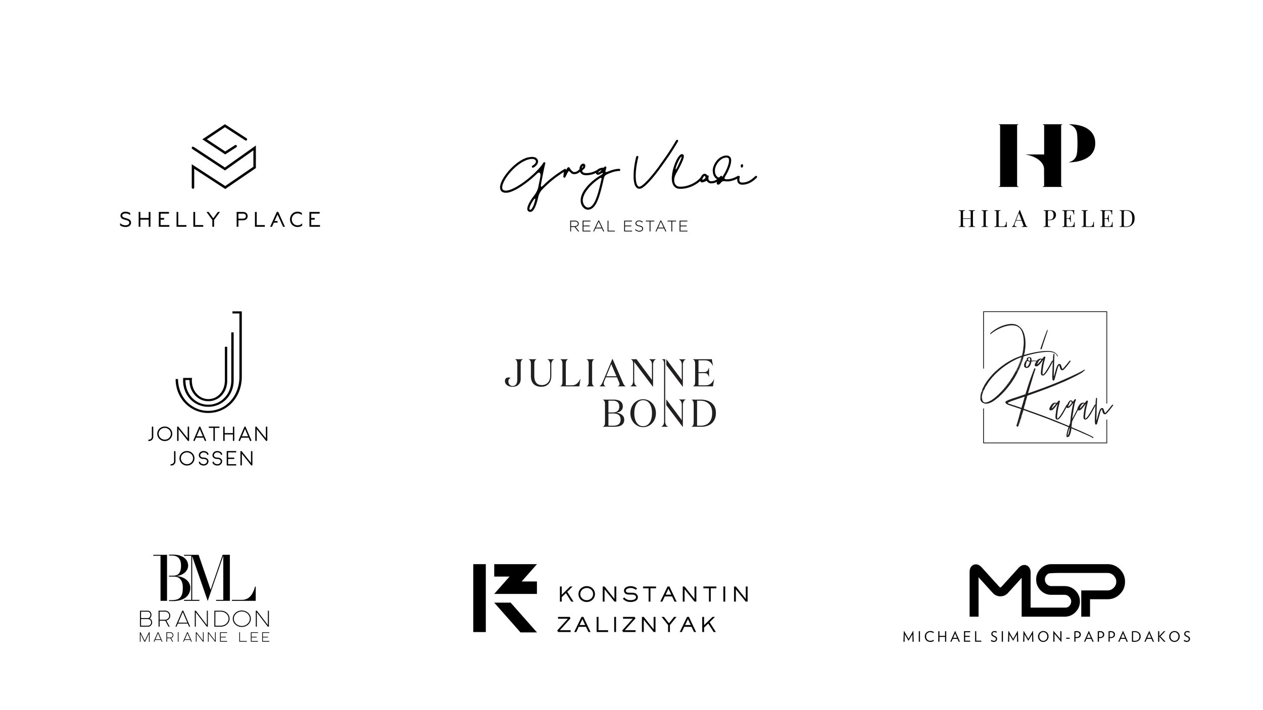
As the Lead Graphic Designer at Triplemint, I spearheaded the refresh of the start up’s brand guidelines, ensuring a cohesive and modern visual identity. I crafted top-tier marketing materials and developed unique branding for agents and properties, maintaining brand consistency across all platforms.
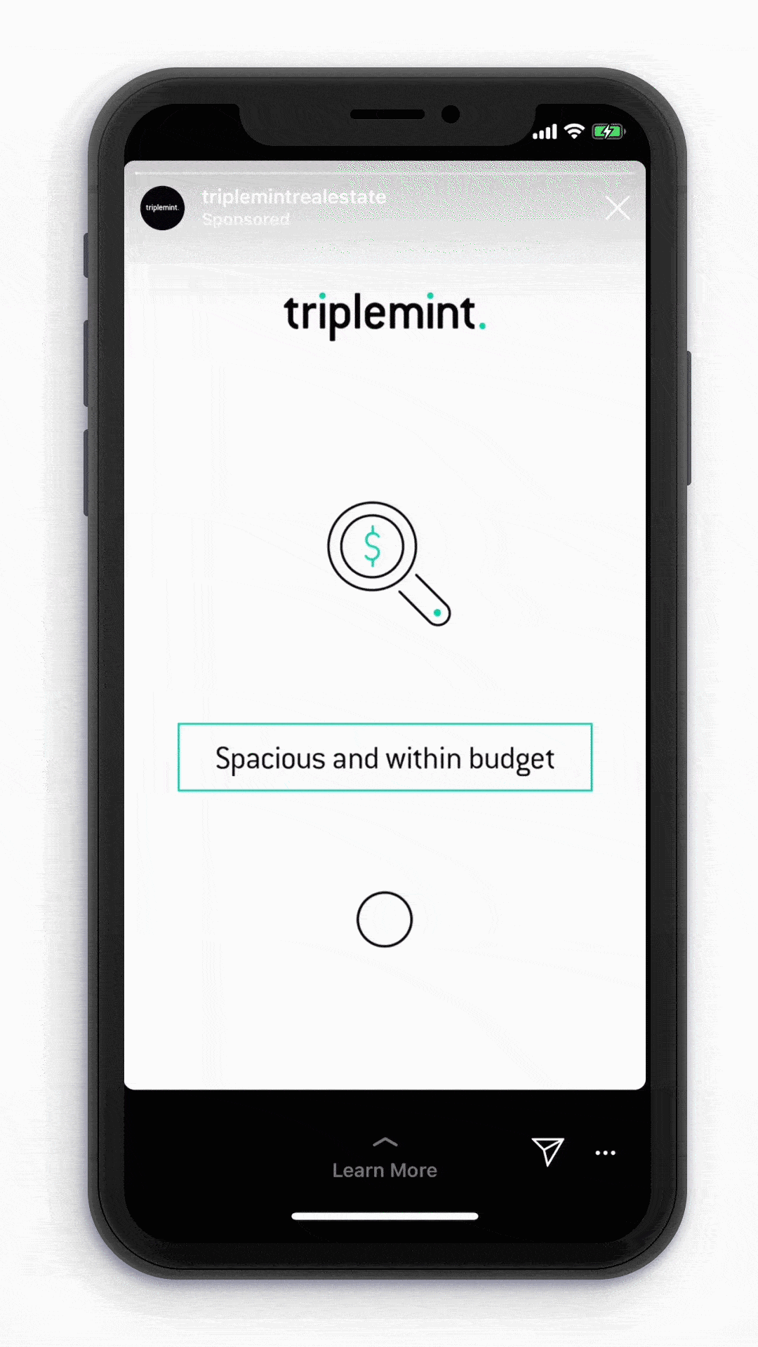


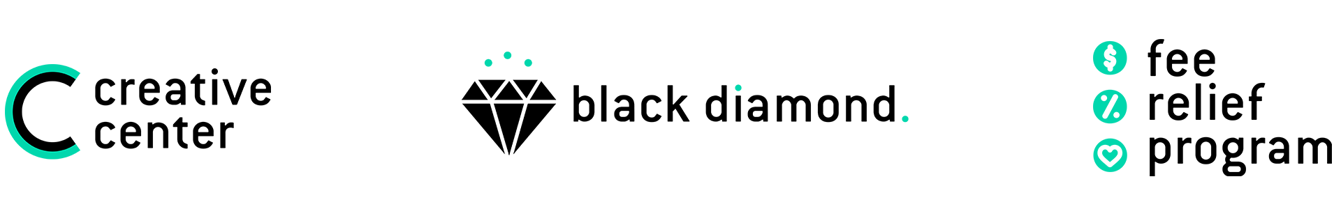
Triplemint icons and illustrations have been designed to reflect the brand. They should be linear, simple, and always using 1 or 3 dots (or any odd number).


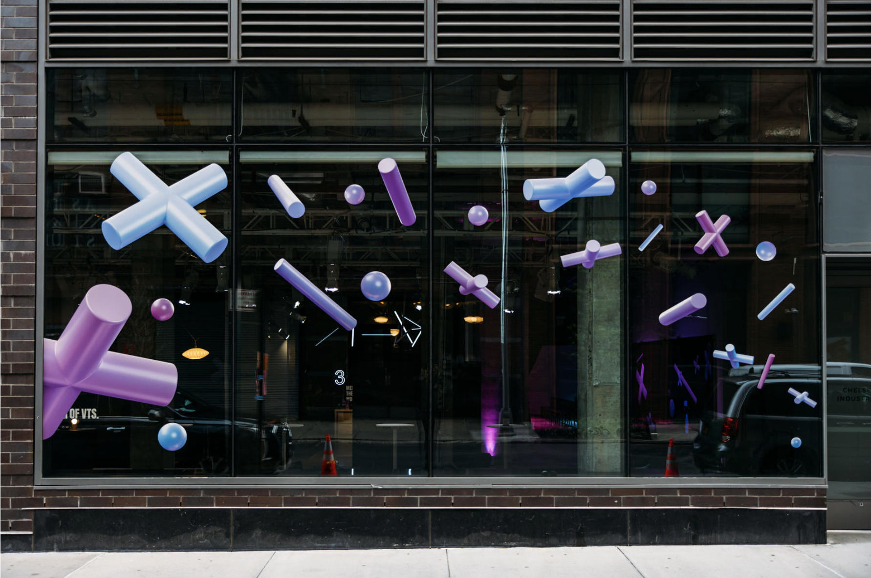
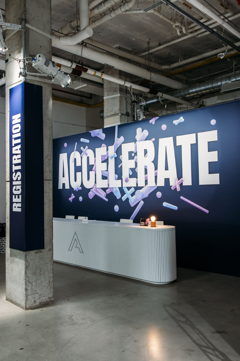
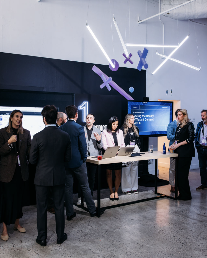
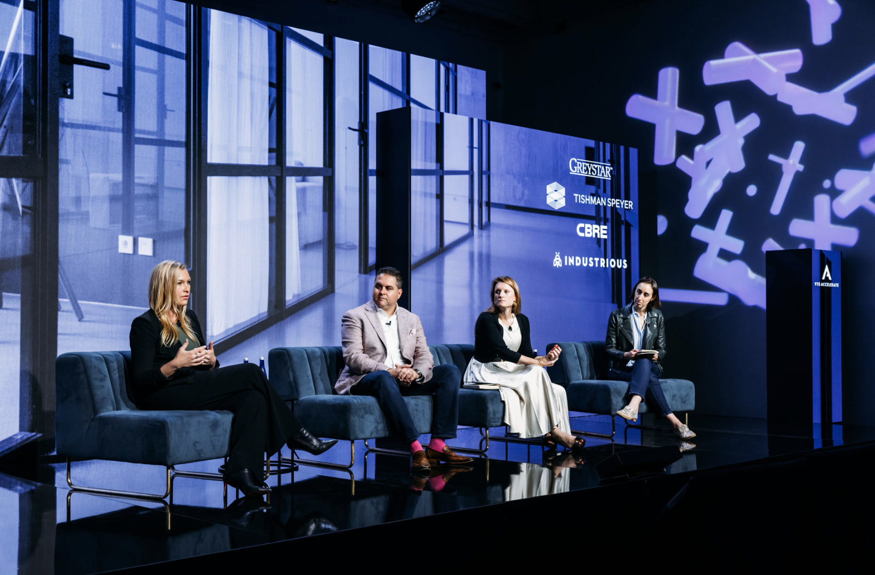
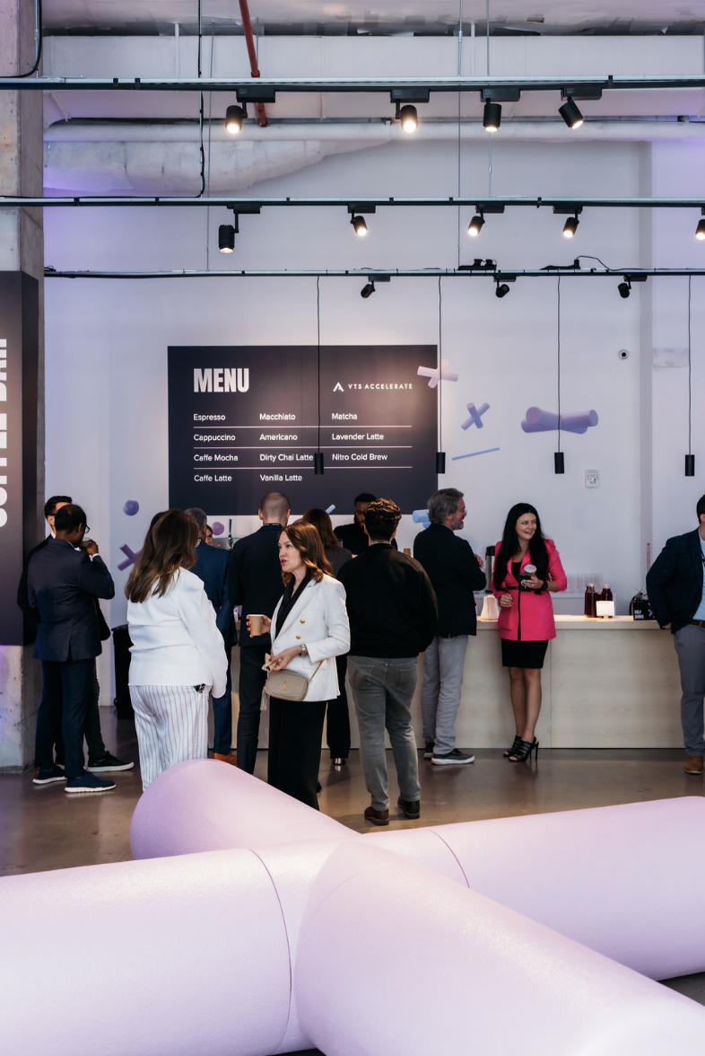
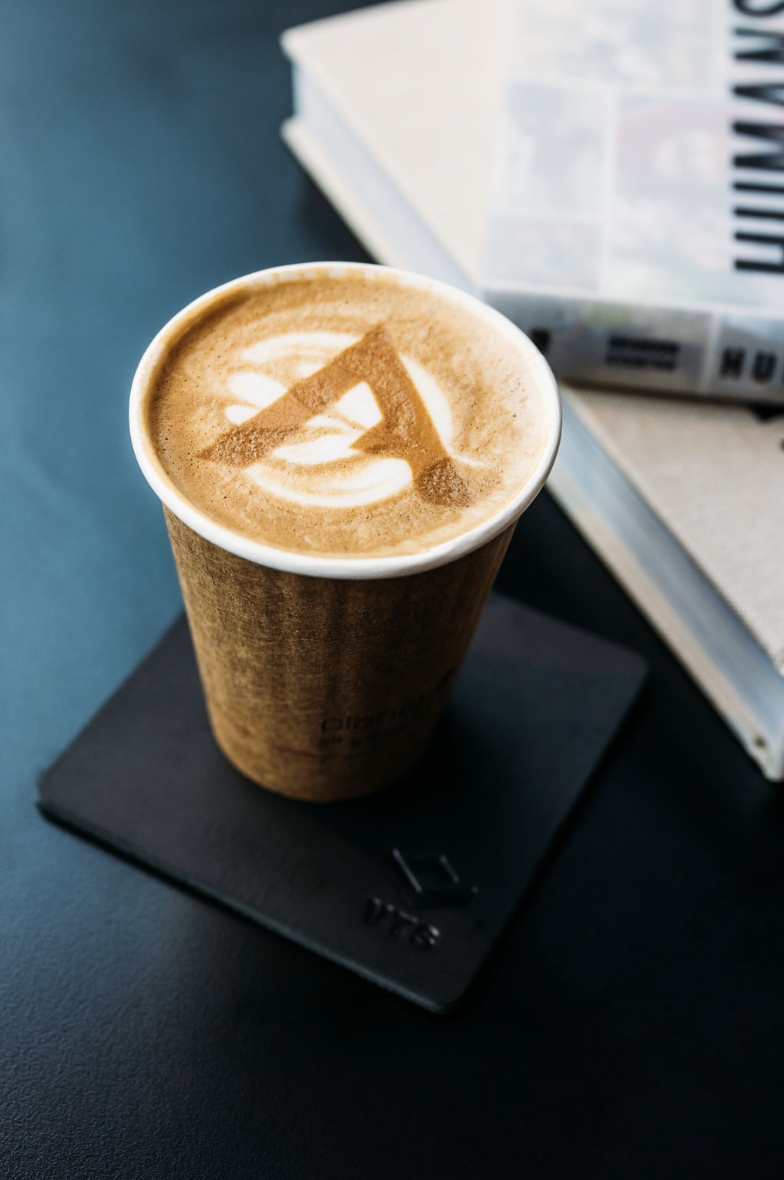
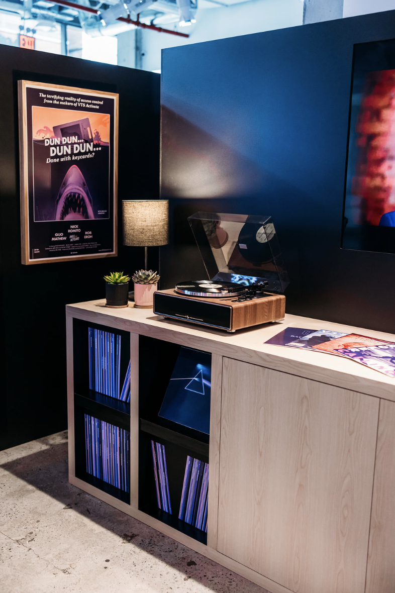
VTS Accelerate
︎︎︎ Art Direction, Experiential Design, Branding
In my role as Senior Design Manager at VTS, I collaborated with the agency These Days and the rest of the VTS Creative Team to develop innovative and immersive branding and experiential design for VTS’
flagship corporate event, Accelerate. Our goal was to create a unique and engaging experience that would leave a lasting impression. This project allowed me to blend creativity with strategic thinking, resulting in a vibrant and cohesive brand identity that resonated with the audience and elevated the event's overall impact.


Harvard Public Health Magazine
︎︎︎ Layout Design, Motion Graphics
Crafted social media ads for Harvard Public Health Magazine, utilizing their brand elements and design language. The visually compelling and strategically designed ads successfully drove leads and increased newsletter sign-ups. This campaign not only enhanced the magazine's visibility but also strengthened its connection with the audience, reinforcing its voice in public health.


Tropical Island Party
︎︎︎ Art Direction, BrandingIn my role as Senior Design Manager at VTS, I collaborated with the VTS Events Team to design the branding and visual elements for an exclusive, invite-only Tropical Island Party hosted by Dealpath and VTS at Aloha Beautiful in Orlando for Realcomm. The event theme was a vibrant Hawaiian retreat, featuring a live DJ, tiki-inspired frozen drinks, and an immersive island backdrop. My designs included event logos, invitations, a landing page, and venue decor, transforming the space into a tropical paradise and providing attendees with a fun, relaxing environment to network and unwind.


